The Cinematography of the DCEU
by Tyler Patrick for the Legends of DC Blog
I want to take a moment and talk cinematography, the look and color of the film. We are three films in and two on the horizon. When I was watching each film I like that each film has its own look. They are different from each other, I don't want to draw too many comparisons to Marvel but each film looks the same. With that being said lets look at each film individually.
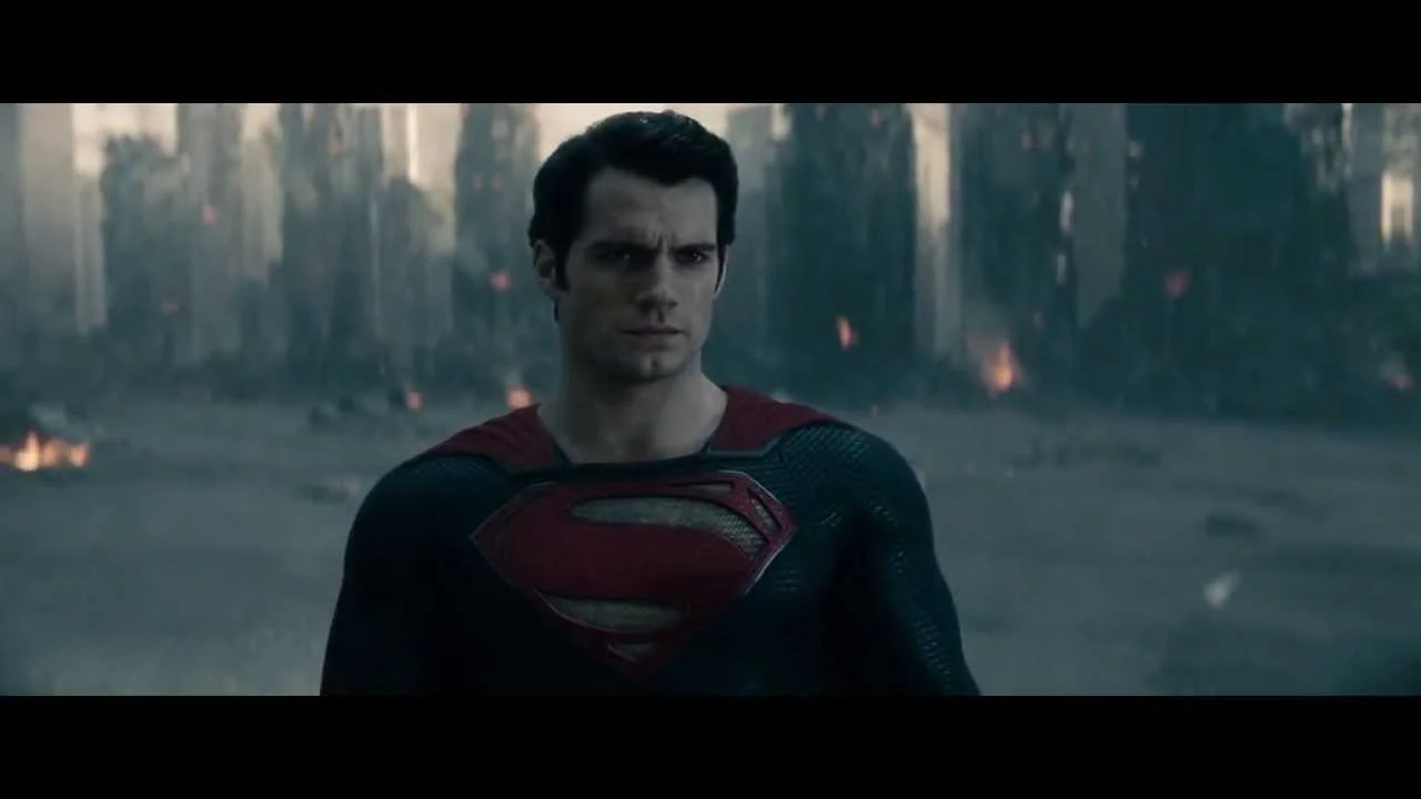
2013 Man of Steel
Director: Zack Snyder
Cinematographer: Amir Mokri
The look of Man of Steel was dark for the property, the colors had a metallic steel look with grays.

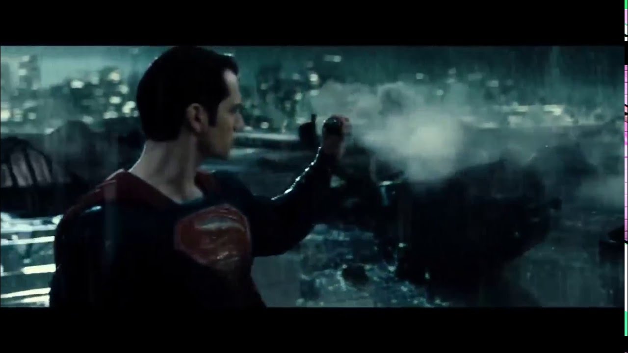
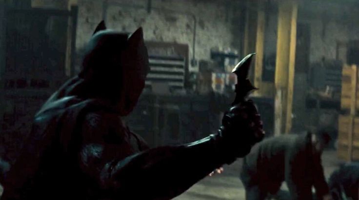
2016 Batman v Superman: Dawn of Justice
Director: Zack Snyder
Cinematographer: Larry Fong
Fong has worked on almost every Snyder film so it was nice to see him return. His style is dark with bright color. Superman’s suit is brighter, the tone is different with that.
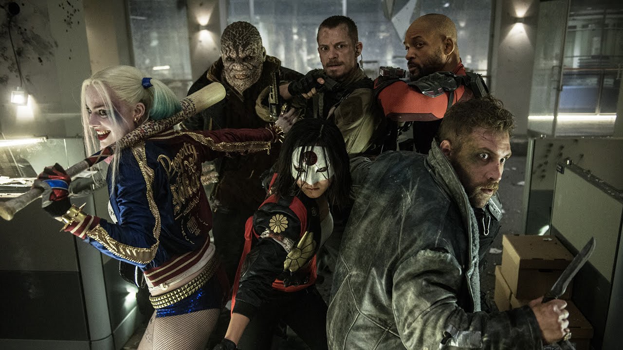
2016 Suicide Squad
Director: David Ayer
Cinematographer: Roman Vasyanov
Long time partner with Ayer, his work seems to have more of a realism to it, there is a natural way that the shots are lit and used.

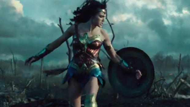
2017 Wonder Woman
Director: Patty Jenkins
Cinematographer: Matthew Jensen
From what we can see it is bright but still shows color and still has a grey tint.

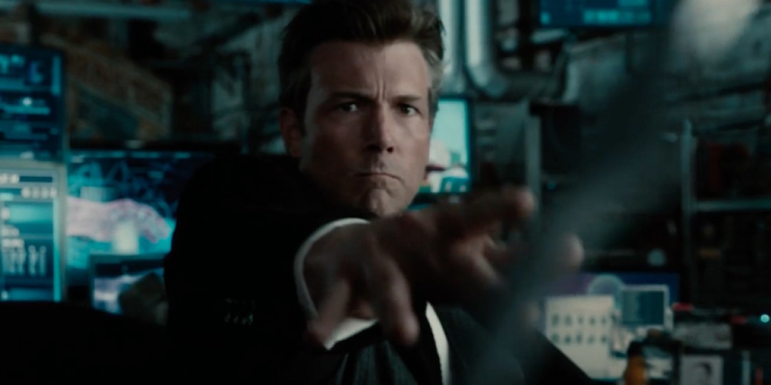
2017 Justice League
Director: Zack Snyder
Cinematographer: Fabian Wagner
My biggest disappointment with this is that it looks very similar to what we saw with BVS. In the idea of visual story telling I figured Justice League could be brighter,but maybe we will see that in Justice League 2. The Idea of Man of Steel is a world without hope, so it’s dark. BVS is the transition phase and Justice League is the return of hope.

What are your thoughts?
It's hard to discuss Cinematography from a few frames, but this is for discussion.
@JTYPatrick on Twitter